WEBSITE PORTFOLIO

Serena Ferrari | Squarespace Expert | Digital Marketing Specialist

WEBSITE DESIGNCAROLI HOTELS
HOSPITALITY
I designed the first website for “Intersezioni nel Salento,” transforming six years of cultural programming into a mobile-first digital archive.
Built on Squarespace, the site presents past editions through talks, roundtables, and project visuals. I introduced a user-generated content (UGC) strategy, inviting guests to share their own photos and stories.
This extended the event’s visibility beyond its physical space and duration.
As one of several events supported by Caroli Hotels, it helped strengthen the brand’s cultural footprint.
The result turned attendees into long-term ambassadors for the hotel group.
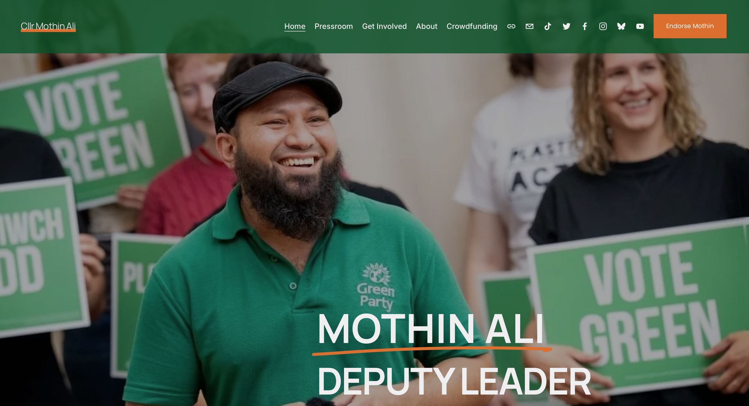
WEBSITE DESIGNMOTHIN ALI
NATIONAL LEADERSHIP CAMPAIGN
Designed and launched the campaign site for Mothin Ali’s run as Deputy Leader of the Green Party of England and Wales.
Built on Squarespace for rapid deployment, the site uses scroll-triggered animations and mobile-first layouts to drive engagement.
I wrote all content, structured the UX for fast navigation, and integrated Action Network for sign-ups, donations, and data capture.
SEO was implemented from the ground up to improve visibility throughout the 3-month campaign.
A Vox Pop gallery amplified real supporter voices and social proof. The site became the central hub for press, updates, and social media—supporting a winning campaign.
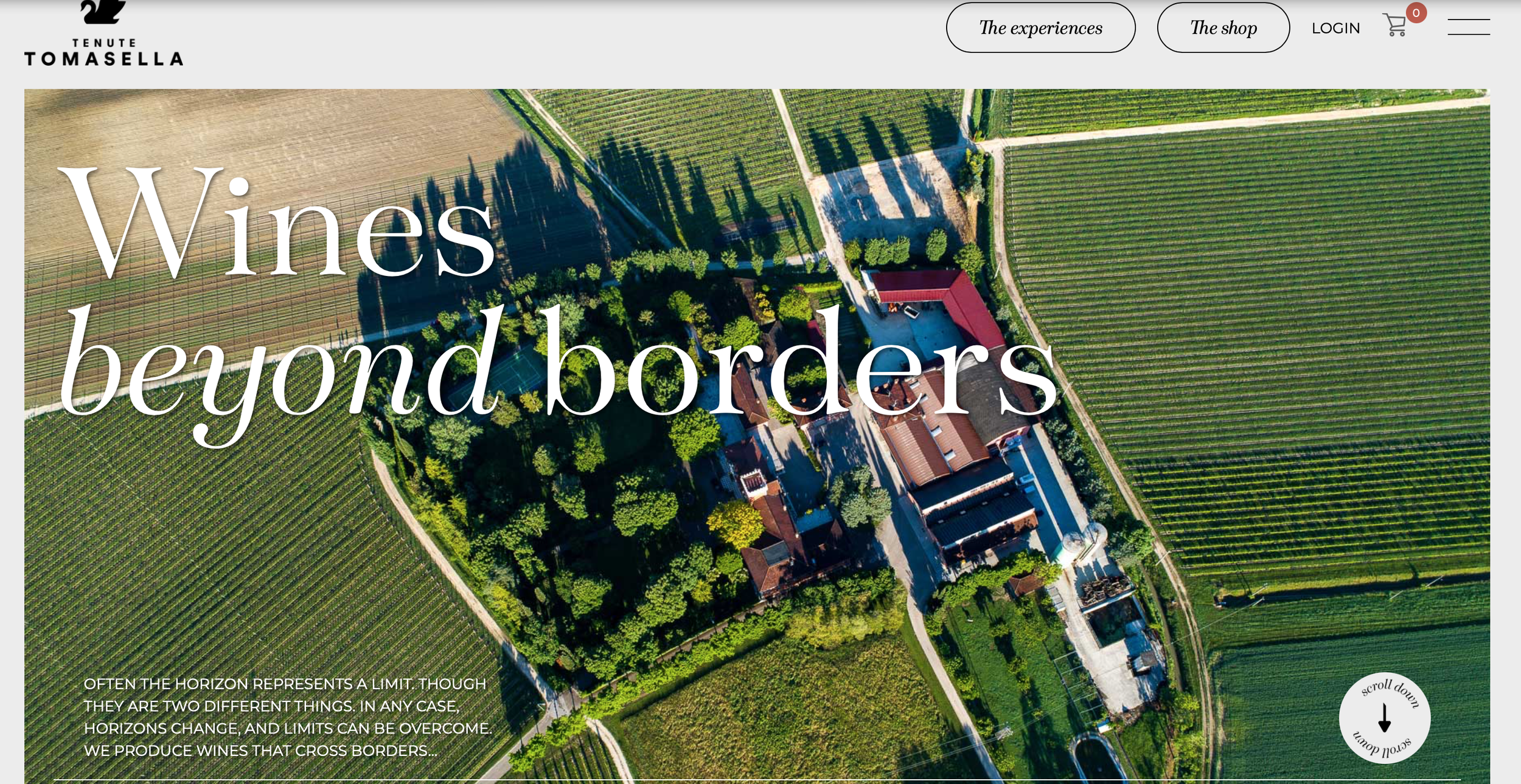
WEBSITE DESIGNTENUTE TOMASELLA
E-COMMERCE, WINE PRODUCER, ITALY
Redesigned the website for Tenute Tomasella, giving the brand a modern, mobile-first layout with integrated e-commerce and wine tourism experiences.
Migrated all content and added an English version to target the U.S. market, with clear paths to shop and book visits.
The site combines storytelling with direct conversion tools, improving usability across languages.
The result is a scalable digital platform that supports international growth, product sales, and brand positioning.
WEBSITE DESIGNALEX FIX
ELECTRICIAN, LOCAL BUSINESS
Designed a mobile-first Squarespace site for Alex Fix, electrician and IT technician focusing on geolocalisation.
Built in Italian with a clean layout to showcase key services: electrical, IT, CCTV, smart home.
Optimised for local SEO to increase visibility in high-intent search results.
Integrated Google Ads and Meta retargeting to drive targeted traffic.
Fast-loading, responsive, and structured for quick client contact.
The site supports lead generation and local brand credibility.
WEBSITE DESIGNLANGUAGE SCHOOL
WEBSITE REVAMP
I revamped the website for an English language school by refining the existing color palette to be bolder and more engaging, while adopting a cleaner, minimalist aesthetic.
The redesign focused on enhancing the overall user experience by improving site navigation and streamlining access to existing features such as online courses, downloadable educational materials, and audio products.
The e-commerce functionality was also optimised to make the purchase and download process more intuitive and user-friendly.
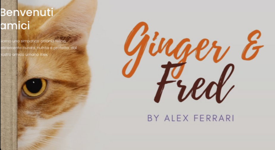
WEBSITE DESIGNCAT CHARITY
NON-PROFIT WEBSITE
I redesigned the website to improve clarity, navigation, and overall user experience while keeping all existing functions intact.
The revamped site now presents the organisation’s mission—supporting animal welfare and promoting adoptions—more clearly and accessibly, Navigation was streamlined so visitors can more easily find key sections such as animal adoptions, volunteering opportunities, donation and support options, and informational content about campaigns and projects.
The update also simplified the process for users to access and interact with content without adding new features, enhancing engagement and usability across the site.
WEBSITE DESIGNCREATIVE SHOWCASE
PORTFOLIO & ONLINE SHOP
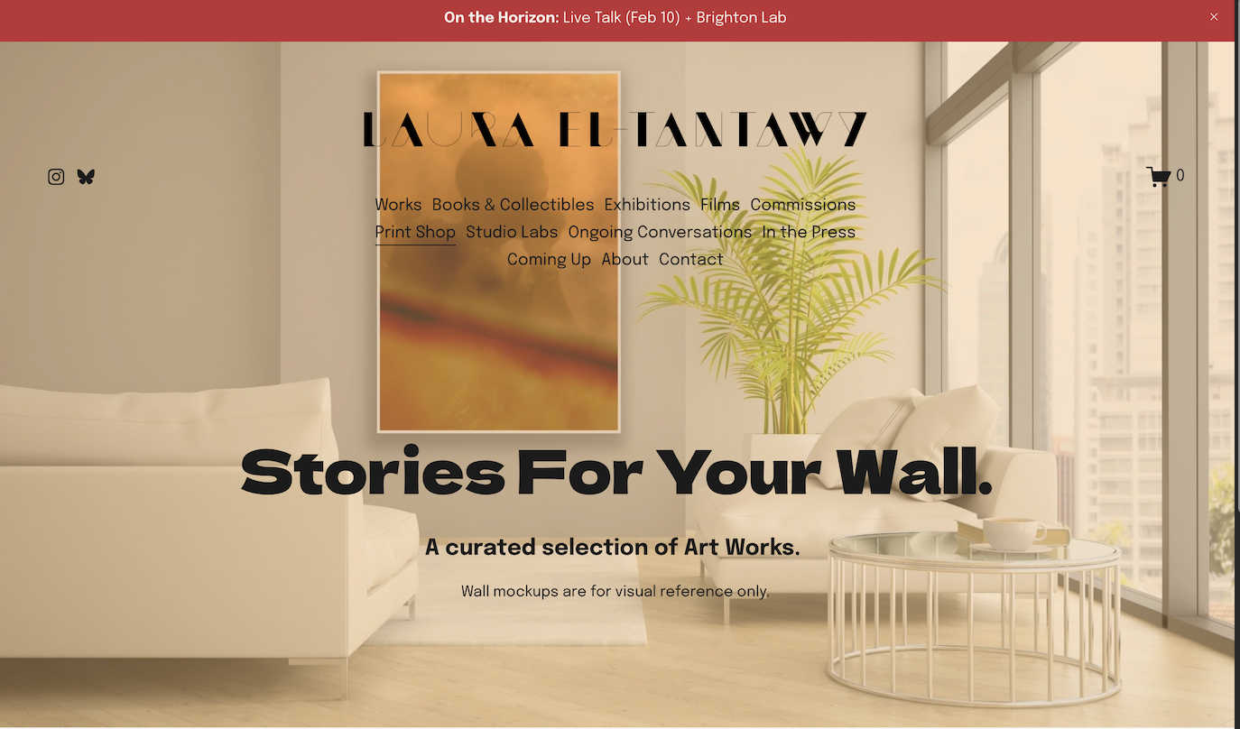
Designing LauraEltantawy.com was about translating emotion into structure—building a space that holds the weight and intimacy of Laura’s photographic work. From the start, the goal was clarity with soul.
Her projects, grounded in personal and political storytelling, needed room to breathe. The design leans on quiet simplicity: clean typography, intuitive navigation, and a calm, neutral palette that lets each image speak without noise.
Sections like Works, Books & Collectibles, Exhibitions, and Films form the backbone, but it’s the small touches—the slow reveal of images, the pacing of content—that mirror Laura’s lyrical visual voice.
Adding the SHOP brought another layer: a thoughtful corner where visitors can collect her prints, explore her books, or book her for speaking engagements. It’s more than a transaction—it’s an invitation to connect.
The outcome is a site that doesn’t just showcase work; it reflects process, presence, and purpose. A digital extension of Laura’s practice—quiet, intentional, and open.
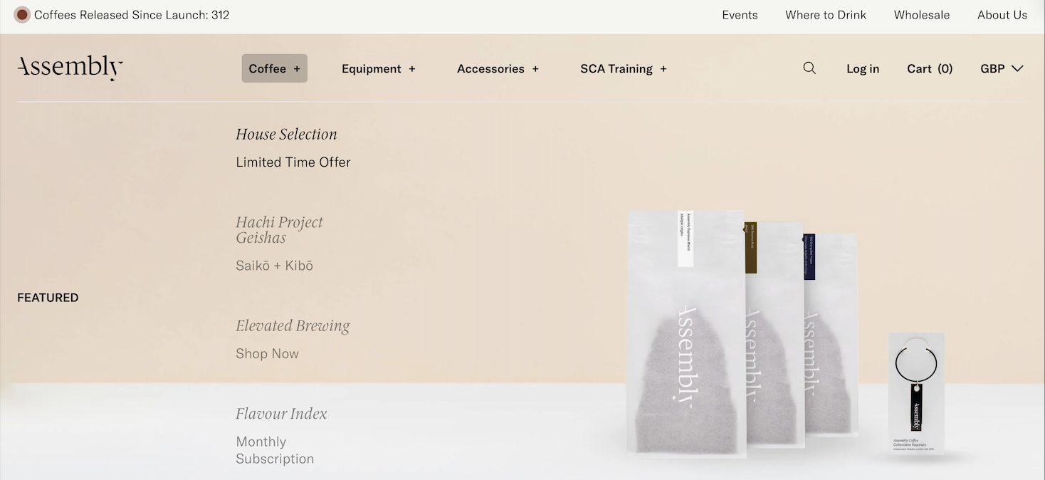
WEBSITE DESIGNCOFFEE BRAND
E-COMMERCE & SHOWCASE
Designing the Where to Drink page for Assembly Coffee was about creating a simple, intuitive experience that connects people with great coffee—wherever they are.
The brief was clear: showcase Assembly’s growing network of partner venues in a way that feels accessible, real-time, and brand-aligned. The solution was an interactive map that replaces a static list with dynamic exploration.
I focused on usability first—keeping the interface clean and responsive across devices. Whether you're on mobile looking for a café nearby or browsing internationally, the map loads quickly and pinpoints locations with minimal friction. Each map point represents a trusted partner that shares Assembly’s values around craft and quality.
Visually, I maintained Assembly’s modern, understated aesthetic—neutral tones, bold typography, and plenty of white space to echo their packaging and brand language. The experience is informative without being overloaded, allowing users to discover new cafés organically while subtly reinforcing Assembly’s presence in the global specialty coffee scene.
The result is more than a directory; it’s a curated journey through the community that makes up Assembly’s extended coffee family.
WEBSITE DESIGNEVENT SPEAKER
PERSONAL PORTFOLIO
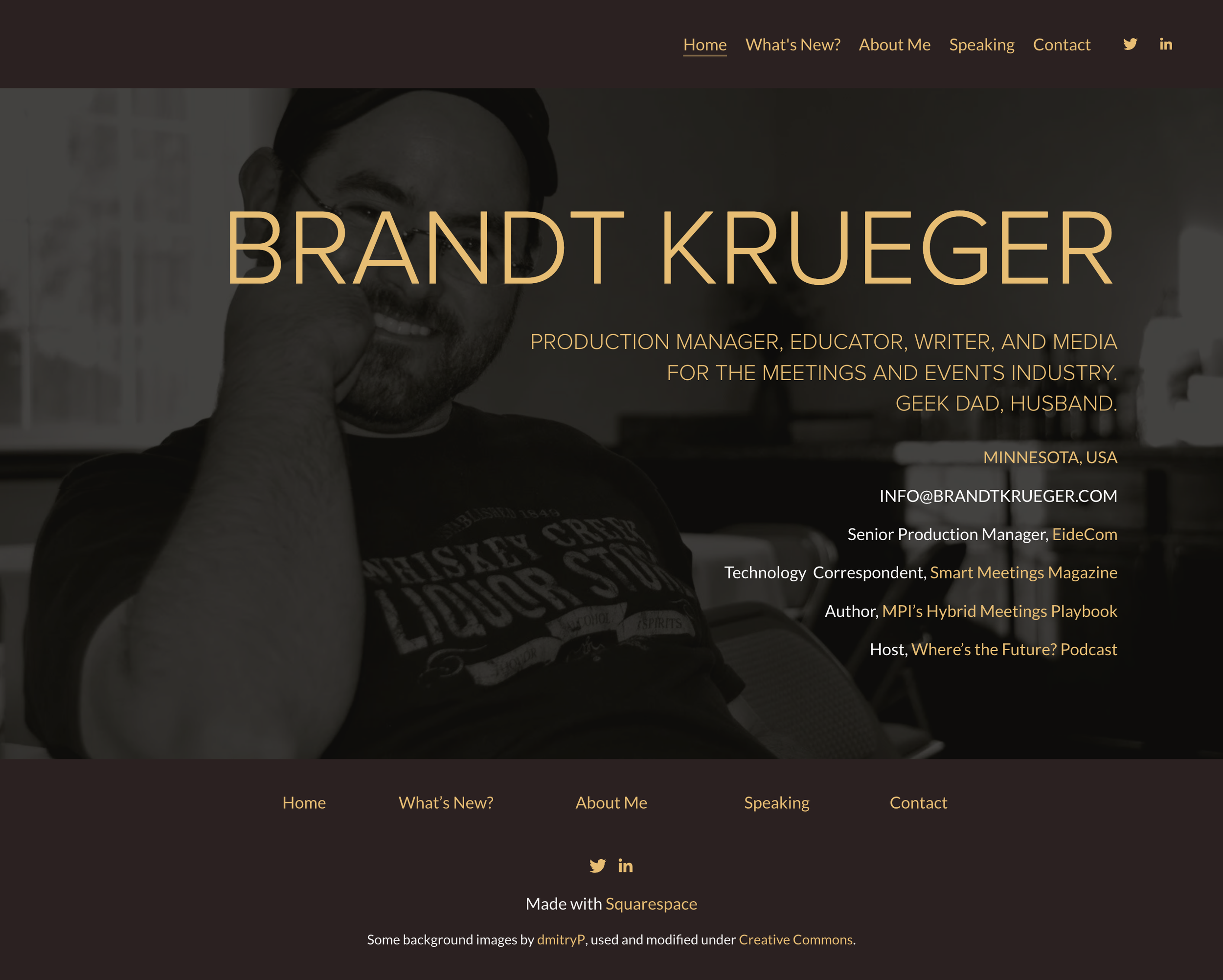
When approaching the design of BrandtKrueger.com, my primary goal was to craft a digital presence that mirrors Brandt’s professional identity: clear, confident, and deeply rooted in event technology and education.
The homepage immediately establishes Brandt’s multifaceted role in the meetings and events industry—production manager, educator, author, and media contributor—without clutter or distraction, using a minimal layout that leads with name and professional titles to set tone and hierarchy.
I chose a clean navigation structure (“Home,” “What’s New?,” “About Me,” “Speaking,” “Contact”) to ensure visitors can intuitively find key information, from his background and speaking credentials to ways to engage him for events.
The generous white space and uncluttered typography emphasise content clarity, reflecting Brandt’s own philosophy of making complex audiovisual and event technology topics accessible.
Designing this site on a platform like Squarespace allowed me to balance aesthetic and simplicity. The experience is seamless across devices. Subtle background imagery adds visual interest without overshadowing core conten. Neutral palettes, refined fonts, and well placed visuals—maintains a professional yet approachable presence throughout.
The outcome is a personal brand site that feels authoritative yet welcoming, channeling Brandt’s voice and expertise into a digital format that supports his role as a thought leader in the events space.
LANDING PAGE DESIGNROB ELECTRICIAN
LOCAL BUSINESS
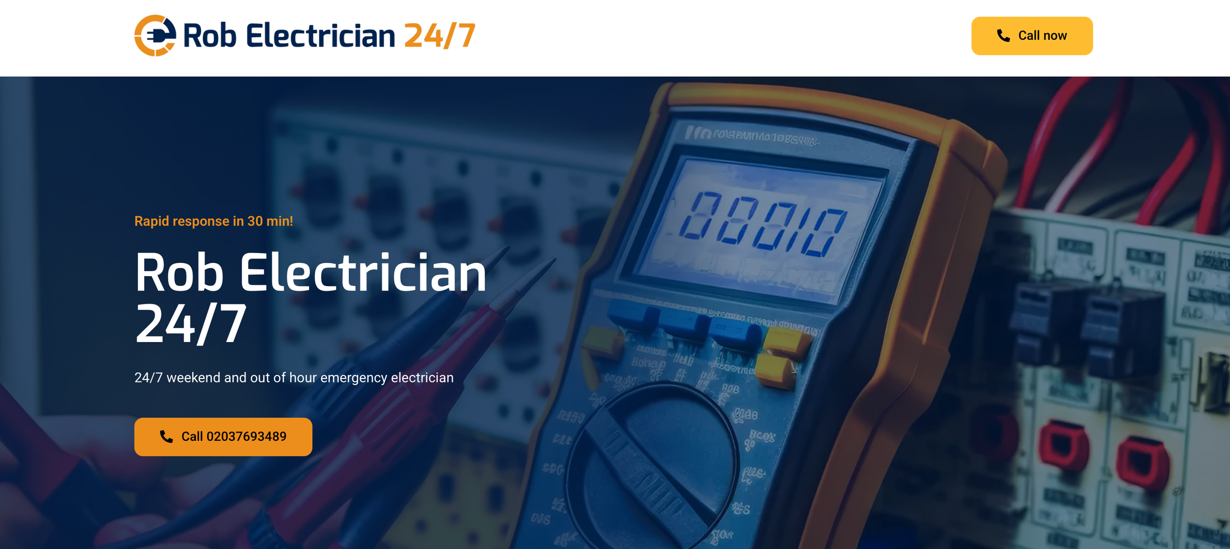
For It Is Rob Electrical, I created a lead-generation landing page built to capture high-intent local traffic from Google Search, Google Maps, and paid ads.
The page is designed for speed and clarity, with bold headings, repeated call prompts, and a prominent phone number creating a fast route from first click to enquiry, particularly for users searching for urgent electrical services.
Messaging such as Rapid response in 30 min! and 24/7 emergency electrician immediately sets the tone, while concise service sections for emergency call-outs, installations, rewiring, and repairs make the offer easy to understand at a glance.
Trust markers including NICEIC and NAPIT certification help reinforce credibility, and the overall visual approach stays simple, practical, and conversion-focused, with minimal distractions and a clear hierarchy throughout.
The result is a straightforward landing page built not for browsing, but for action — giving the business a stronger platform for local lead generation and paid traffic.
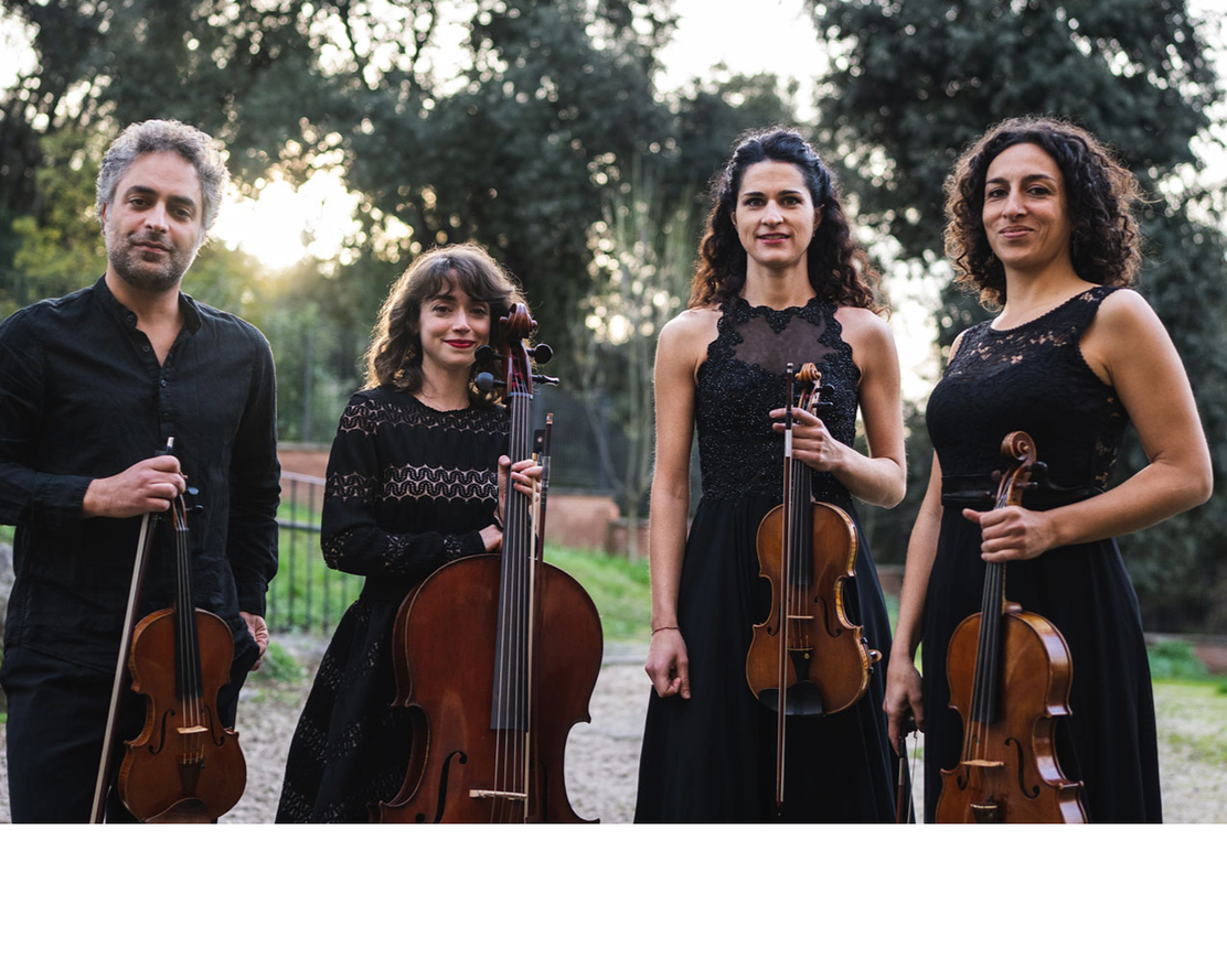
WEBSITE DESIGNQUARTETTO SINCRONIE
CLASSICAL MUSIC ENSEMBLE
With Quartetto Sincronie, the aim was to put music first, so the homepage opens on a track from the ensemble’s debut album Monteverdi–Malipiero, allowing the experience to begin with listening before any text is read.
The quartet wanted sound to lead and images to deepen that atmosphere, which shaped a calm, structured interface built around clear sections for About, Discography, Concerts, Repertoire, Media, and Contact.
The discography page gives particular focus to the album, including its ICMA 2025 nomination, a booklet download, and direct listening and purchase pathways through Spotify, Stradivarius, and Clicmusique, while the concerts page functions as a simple diary of performances, venues, and programme details.
A dedicated repertoire section reflects the range of the ensemble’s work, spanning core classical composers alongside twentieth-century and contemporary figures, and the media area presents photography and video in a clean gallery format.
The result is a website that feels closer to a digital programme than a conventional artist site: immersive from the first note, precise in its structure, and easy for the ensemble to update as new performances, recordings, and coverage are added.
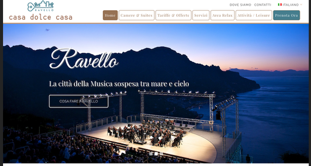
WEBSITE DESIGNCASA RAVELLO
BOUTIQUE HOTEL ALONG THE AMALFI COAST, ITALY
I designed the Casa Dolce Casa website to present the hotel as more than just accommodation, positioning it as an entry point into the history, atmosphere, and visual identity of Ravello and the Amalfi Coast. Drawing on the destination’s elevated setting, sea views, and strong sense of character, I created a digital experience that felt rooted in place while still functioning clearly as a booking-focused hospitality site.
Large, immersive photography, simple navigation, and well-defined user journeys helped international visitors quickly understand the suites, services, and local experiences on offer, while clear calls to action made enquiry and booking feel seamless.
The challenge was to balance emotion with utility — capturing the romance and distinctiveness of Ravello while ensuring the site performed commercially for a global audience.
The result is a website that feel both evocative and practical, strengthening the hotel’s identity and contributing to a 25% increase in direct enquiries from overseas guests.